Logo & Brand Resources
So, you’re looking for a copy of the Woodman’s logo...
First off, thank you for taking the time to navigate to this page. Our logo is important to us, and we hope that before using our logo, you will take some time to read the notes below and learn a bit about how to properly represent the Woodman’s brand.
The Woodman’s name and brand are synonymous with great savings, huge selection, overall value, and a friendly face. It’s important that our brand message promotes all these principles. These guidelines are fundamental to ensure our brand and logo are displayed coherently and correctly, regardless of who created the content or where it is seen.
If you’re looking for ShopWoodmans.com resources, please click here
Our Logo
Our logo is our own mark on the world, and it’s important that it is used properly and in an unaltered fashion. The Woodman’s Logo is available in two primary options: Standard and Condensed.
Standard:
Employee Ownership is foundational to Woodman’s identity; therefore, the standard logo should be the first option whenever possible.
Condensed:
There are a few instances where the standard logo may not be the best choice. For example, where the aspect ratio is short and wide, or when using the full logo would result in smaller branding overall.
RESTRICTED USE Logo & Sub-Logos:

The restricted use version of the logo should be avoided in most cases. This logo should only be used to display Woodman’s participation, endorsement, or when displaying “Employee Owned” would distract from another primary message.
In addition to the restricted use version of the logo, there are a variety of other sub-logos. For example, our online shopping site, ShopWoodmans.com, or our employee wellness program, Be Well. These logos are not approved for general usage, but may be approved for use on a case-by-case basis.
If you are going to use one of our logos other than the Standard or Condensed, please contact the Woodman’s Marketing Department for approval before sending your design to print. If you are given approval, please follow the same guidelines as are provided for our primary logos.
Logo Use and Color
The Woodman’s logo should always be clear, easily identifiable, and unaltered.
- On Light backgrounds, use the full color version. This is the preferred option.
- On dark backgrounds or images where there is not enough contrast, a solid white version of the logo should be used.
- When absolutely no other option exists, a solid black version of the logo may be used.
- The logo should always have clear space the size of the “W” on all four sides.
- The logo should always be at least 20px in height.
Logo Misuse
The following Misuses apply to all versions of our logo.
- Do not crop, rotate, or otherwise distort the logo.
- Do not change the color(s) or transparency of the logo.
- Do not use drop shadows, glows, outlines, or other effects on the logo. (a thin white glow may be used in special cases, but must be authorized by the Woodmans’ Marketing Department.
- Do not attempt to recreate the logo with different fonts or apple.
- Do not use former/retired Woodman’s logos.
Woodman’s Color Palette
Primary Color Palette
Woodman’s Red
Hex: #dc1f26
CMYK: 8, 99, 99, 1
Uses: Headline Text, Backgrounds
Woodman’s Graphite
Hex: #3a3939
CMYK: 68, 62, 61, 53
Uses: Body Text (light backgrounds)
Woodman’s Deep Ocean
Hex: #292a72
CMYK: 100, 99, 24, 10
Uses: Background, Logo
Woodman’s Sunny Day
Hex: #f9e236
CMYK: 4, 5, 89, 0
Uses: Backgrounds
Woodman’s Pure White
Hex: #ffffff
CMYK: 0, 0, 0, 0
Uses: Body Text (dark backgrounds)
Secondary (Supporting) Color Palette
Gold Coin
Hex: #f5c930
CMYK: 4, 19, 92, 0
Leafy Green
Hex: #0e6635
CMYK: 89, 34, 99, 28
Golf Course Cactus
Hex: #34a863
CMYK: 77, 8, 82, 1
Blue Sky
Hex: #2b79c7
CMYK: 80, 49, 0, 0
Deight
Hex: #f1494f
CMYK: 0, 87, 67, 0
Typography
Consistent and matching typography is an important step to keeping our brand cohesive.
- Woodman’s associates are required to follow these guidelines when creating content. Vendors are not required to use Woodman’s typography guidelines, but should still strive to provide a clean and clear message.
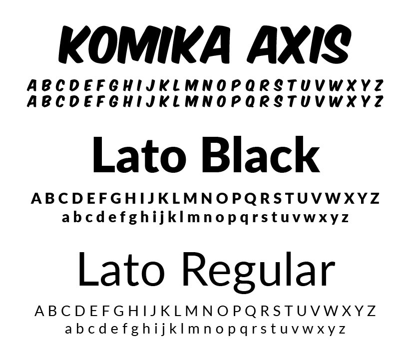
- Headlines: Komika Title-Axis or Lato Black
- All other text: Lato Regular
- Headlines should be centered or left-aligned; all other text should be left-aligned.
- Headlines may be ALL CAPS, but other text should be sentence case.
- Drop Shadows or outlines may be used on headlines, so long as they do not affect legibility or any other text.
- Never substitute a similar font for Komika Title-Axis. If you are unable to use Komika, please use Lato Black.
Voice & Tone
The Woodman’s voice is informal and friendly. We like to create excitement and use fun phrases in our brand, but the message should never be sloppy. Aim to provide a clear message, but not sound like a faceless mega-corporation.
- Our voice is inclusive – everyone needs groceries! Use neutral terms such as “You” instead of specific pronouns.
- Localize it! When applicable use phrases such as “Hey Janesville…”
- If your message revolves around a product, aim to promote value and selection, and avoid solely looking “cheap”.
- Fun phrases such as “Wow!”, “Hot! Hot! Hot!”, or, “Ay-Carumba” can be used, but should be reserved for truly exceptional deals.
- Aim to use our tagline, “Low Prices, Every Aisle, Every Day,” or similar phrases such as “Janesville’s Low Price Leader” when your message does not involve product.
ShopWoodmans.com Resources
ShopWoodmans.com is Woodman’s e-commerce website, which allows customers to shop Woodman’s massive selection and amazing savings from the convenience of their phone or computer.
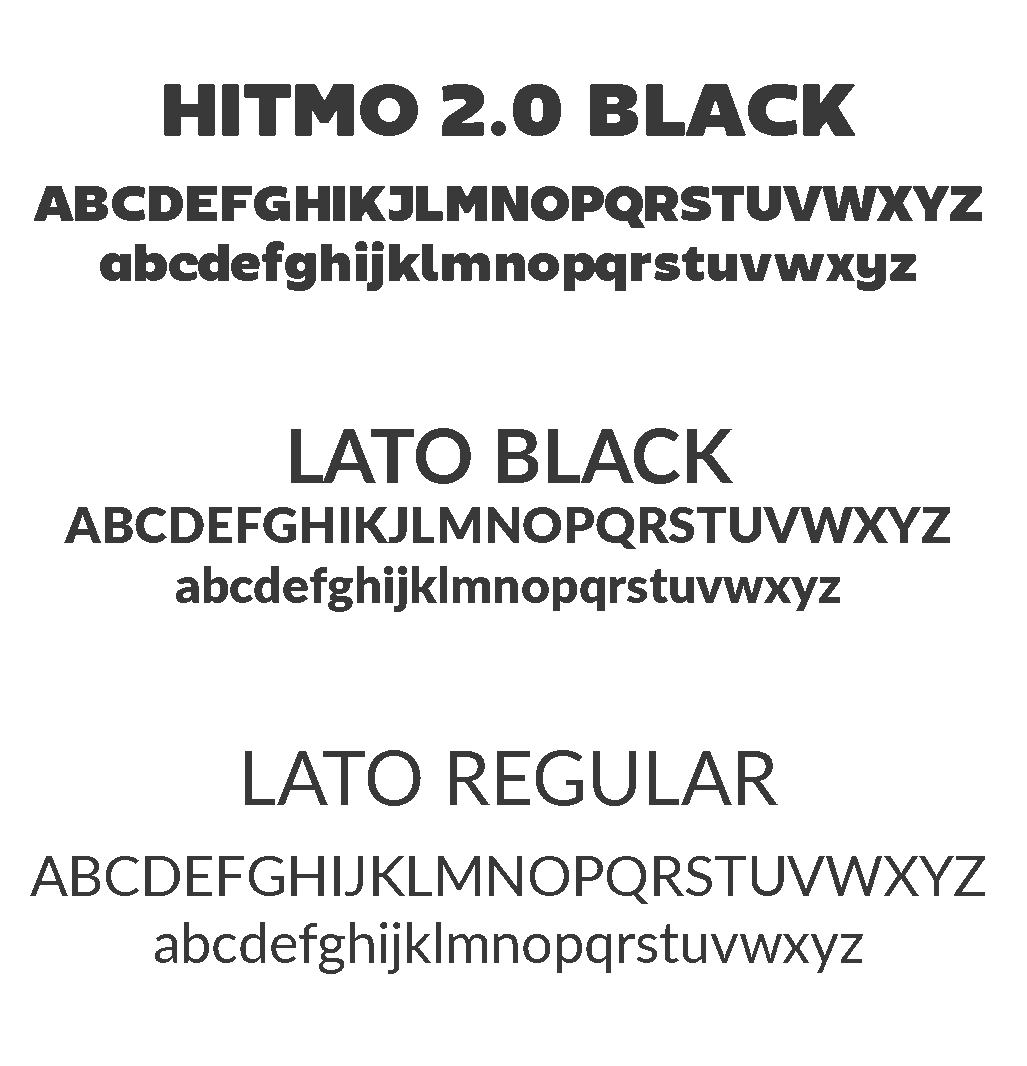
ShopWoodmans.com shares many branding resources with Woodmans. The main exceptions are the ShopWoodmans.com logo and the use of the headline font, Hitmo 2.0, in place of Woodman’s Komika Title-axis.
ShopWoodmans.com Logo
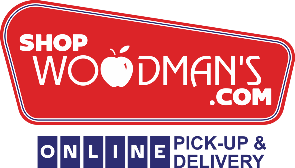
The ShopWoodmans.com primary logo is available in various formats at the download link below.
Typography
The same typography considerations which apply Woodman’s Logos apply to ShopWoodmans.com Typography.
- Woodman’s associates are required to follow these guidelines when creating content. Vendors are not required to use Woodman’s typography guidelines, but should still strive to provide a clean and clear message.
- Headlines: Hitmo 2.0 or Lato Black
- All other text: Lato Regular
- Headlines should be centered or left-aligned; all other text should be left-aligned.
- Headlines using Hitmo 2.0 should be ALL CAPS, but other text should be sentence case.
- Drop Shadows or outlines may be used on headlines, so long as they do not affect legibility or any other text.
- Never substitute a similar font for Hitmo 2.0. If you are unable to use Hitmo 2.0, please use Lato Black.